
You’ve found the perfect piece of art, but once it’s on the wall, something feels off. The room doesn’t come together the way you pictured. That disconnect is almost always a placement problem, not an art problem. This art placement guide 2026 walks you through exactly what to measure, where to hang, how to avoid the most common mistakes, and how to work with current design trends so your walls finally look intentional. Whether you own your home or rent, these strategies work for any space and any budget.
Table of Contents
- Key takeaways
- Getting ready: tools and measurements
- How to hang art step by step
- Mistakes that make rooms look unfinished
- 2026 trends and personalizing your display
- My honest take on what actually changes a room
- Ready to find art worth placing
- FAQ
Key takeaways
| Point | Details |
|---|---|
| Use the 57-inch rule | Hang art so the center of the frame sits 57 to 60 inches from the floor for comfortable eye-level viewing. |
| Anchor art to furniture | Keep 6 to 8 inches of clearance above sofas or desks so art reads as part of the space, not floating above it. |
| Match strips to weight | Use the correct number of adhesive strip pairs for your frame’s weight and size, not just one strip per corner. |
| Avoid the too-small trap | Art that is undersized for a wall looks accidental. Scale up or group pieces to fill the visual field properly. |
| Refresh displays seasonally | Rotating art every few months keeps your space feeling current without buying anything new. |
Getting ready: tools and measurements
Before you touch a nail or strip, gather what you need. The right preparation saves you from filling unnecessary holes or repositioning frames three times. Here is what belongs in your kit:
- Tape measure
- Pencil
- Level (a small bubble level or a phone app works fine)
- Appropriate hanging hardware: nails, D-ring hooks, or adhesive strips
- Painter’s tape for mock layouts on the wall
Surface type matters more than most people realize. Drywall, plaster, brick, and tile each require different hardware. Adhesive strips perform well on smooth painted drywall but fail on textured or porous surfaces. If your wall has a heavy texture, a nail and hook setup is more reliable.
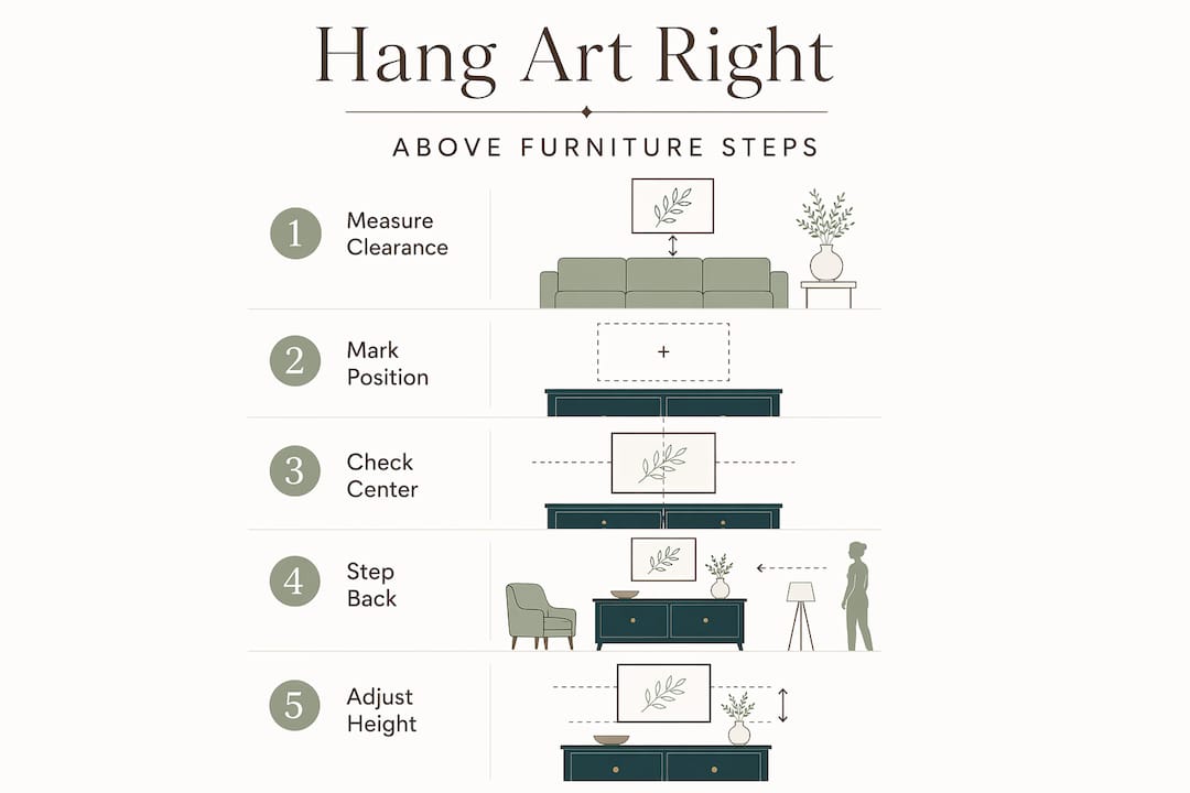
The single most useful number in any wall art placement guide is the 57 to 60 inch center height. This is the professional gallery standard, and it works because it aligns with the average eye level for both standing and seated viewers. Measure from the floor up to that point, mark it lightly with a pencil, and that mark becomes the center of your frame.
To find where the nail goes, measure from the top of the frame down to the hanging hardware on the back. Subtract that number from your center height mark. That final number is where your nail or hook belongs on the wall.
Pro Tip: Tear off a piece of painter’s tape the width of your frame and stick it on the wall before hanging anything. It lets you visualize scale and position without committing to a single hole.
When art hangs above furniture, 6 to 8 inches of clearance above the piece keeps the arrangement grounded. More than 8 inches and the art starts to look disconnected from the room.
| Furniture type | Recommended clearance above | Notes |
|---|---|---|
| Sofa | 6 to 8 inches | Center art over sofa width, not wall width |
| Desk or console | 6 to 8 inches | Single piece or horizontal grouping works best |
| Bed headboard | 4 to 6 inches | Lower clearance keeps art in the sleeping zone |
| Dining table | 8 to 12 inches | Slightly higher works because viewers are seated |
How to hang art step by step
With your measurements in hand, the actual hanging process is straightforward. Follow these steps in order and you will get it right the first time.
- Mark your center height. Find the 57 to 60 inch point on your wall and make a small pencil mark.
- Calculate the nail position. Measure from the top of the frame to the hanging wire or hook at its tightest point. Subtract that distance from your center mark. That is where your nail goes.
- Drive the nail or hook. For standard drywall, a picture hook rated for your frame’s weight is enough. Drive it at a slight downward angle for grip.
- Check level before finalizing. Hang the frame, then hold your level across the top edge. Adjust before the nail sets fully.
- Step back and assess. Walk to the other side of the room. Height and alignment look different from a distance than they do up close.
For renters, adhesive strips are the go-to solution, and the product specs matter. Four pairs of Command Medium strips hold frames up to 10 pounds and 18x24 inches cleanly on smooth surfaces. For larger pieces, Command X-Large strips handle up to 20 pounds for frames up to 24x36 inches. Both options remove without leaving residue when you follow the removal instructions.
The critical detail most people miss is that strip selection depends on both weight and frame size, not just one or the other. A light but oversized frame still needs the larger strip count. Always use the full number of pairs specified for your frame dimensions.
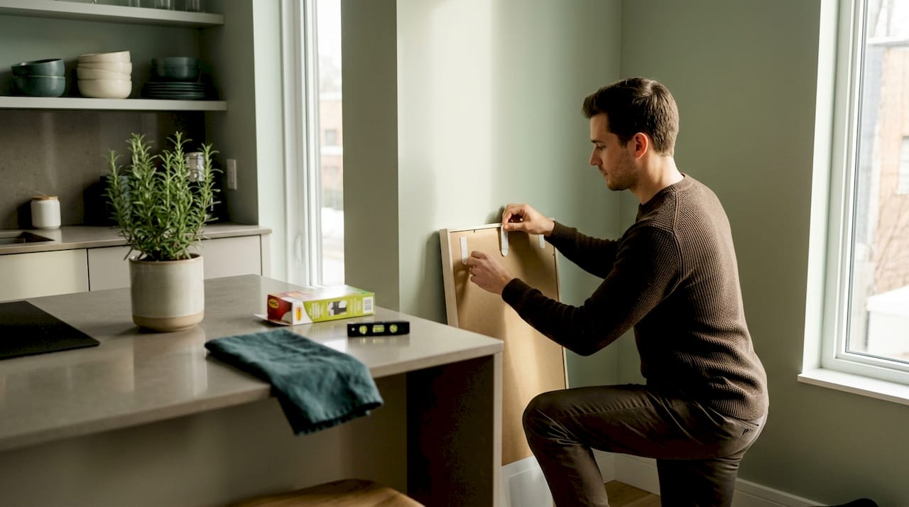
Pro Tip: Press adhesive strips firmly for 30 seconds per pair and wait a full hour before hanging the frame. Rushing this step is the number one reason strips fail.
For heavier original paintings or large canvases, a fine art mover’s approach to wall anchoring is worth studying. Use two anchor points instead of one, and always locate a wall stud when the piece exceeds 20 pounds. A stud finder costs under $20 and removes all guesswork.
Mistakes that make rooms look unfinished
Most art placement problems fall into a short list of repeatable errors. Knowing them before you hang saves a lot of patching.
- Hanging too high. Art centered above 60 inches creates visual discomfort because viewers have to crane their necks. The fix is simple: bring the center down to 57 inches and the whole room settles.
- Art that is too small for the wall. A single 8x10 print on a large wall looks like a sticky note. The art should occupy at least two thirds of the width of the furniture below it, or you should group multiple pieces to achieve that scale.
- Uneven gallery wall spacing. 2 to 3 inches between frames is the standard for a clean gallery wall. More than that and the arrangement reads as scattered. Less and it looks crowded.
- Overloading adhesive strips. Using one strip per corner regardless of frame size is a common shortcut that leads to frames on the floor. Follow the manufacturer’s weight and size specifications exactly.
- Ignoring room sightlines. Art in a hallway is seen at a walking pace. Art above a bed is seen from below while lying down. The 57-inch rule applies to rooms where people stand or sit upright. Adjust for the actual viewing angle in each space.
Working with an interior design framework that accounts for your furniture layout and natural light sources helps you catch sightline problems before anything goes on the wall.
2026 trends and personalizing your display
The best art placement in 2026 blends current design sensibility with pieces that actually mean something to you. Here is what is working right now.
Warm, earthy palettes are dominant this year. Terracotta, sand, sage, and deep ochre are showing up in both art choices and frame finishes. If your walls are neutral, these tones add depth without overwhelming a room. Pair a warm-toned print with a natural wood or matte black frame and the combination feels current without being trendy in a disposable way.
Gallery walls continue to be popular, but the approach has shifted. Matching frames in two or three coordinated finishes look more considered than the eclectic mix of the previous decade. A consistent mat color across different frame styles ties a wall together without making it feel rigid.
- Mix personal and purchased art. Family photos, children’s drawings, and bought pieces can coexist on the same wall. Consistent framing with matching mats unifies color variety and makes even crayon drawings look intentional.
- Use art to define zones. In open-plan spaces, a large piece or a gallery cluster signals where one area ends and another begins. This is one of the most underused art display ideas for modern floor plans.
- Rotate seasonally. Swap out two or three pieces every few months. It costs nothing and keeps the space feeling refreshed. Store pieces flat and wrapped in acid-free paper to protect them.
- Consider the light source. Natural light from the left reads differently than overhead artificial light. Glossy prints reflect glare; matte finishes absorb it. Match your finish to your room’s dominant light source.
Pro Tip: Before committing to a gallery wall layout, cut paper templates in the exact sizes of your frames and tape them to the wall. Live with the arrangement for a day before driving a single nail.
My honest take on what actually changes a room
I’ve watched people spend weeks choosing art and then hang it in five minutes without measuring anything. That’s where the effort gets lost. In my experience, the height rule matters more than almost any other single decision. When art sits at the right center height, the room organizes itself around it. When it’s too high, nothing else in the space can compensate.
What I find genuinely underappreciated is how much renter-friendly mounting technology has changed the game. A few years ago, renters were stuck choosing between bare walls and security deposit losses. Now, with properly applied adhesive strips, you can hang a substantial original painting, take it down cleanly, and leave no trace. The key word is “properly.” I’ve seen strips fail because someone skipped the 30-second press or hung the frame too soon. The product works when you follow the steps.
The other thing I’d push back on is the idea that small spaces can’t handle large art. In my experience, one well-placed large piece in a small room creates more calm and visual clarity than several small pieces competing for attention. Scale up before you assume the space can’t hold it. You might be surprised.
Experiment before you commit. Paper templates cost nothing. Living with a layout for 24 hours before hanging tells you more than any measuring tape.
— Anna
Ready to find art worth placing
Following a solid art placement guide matters most when the art itself is worth placing carefully. Annapinnii’s original paintings and fine art prints are sized and produced with real walls in mind. Whether you are working with a large statement wall or a quiet corner that needs one meaningful piece, the collection offers options that fit the scale and mood of modern interiors.
If you are looking for a single original work to anchor a room, You Were Never Lost is a piece that holds its presence without demanding the whole wall. Each Annapinnii print ships with size specifications that map directly to the placement principles in this guide, so choosing the right piece for your space is straightforward from the start.
FAQ
What height should art be hung at?
Hang art so the center of the frame sits 57 to 60 inches from the floor. This is the professional gallery standard and works for both standing and seated viewers.
How much space should be between art and furniture?
Leave 6 to 8 inches of clearance between the top of a sofa, desk, or console and the bottom of the frame. This anchors the art visually to the furniture below it.
Can renters hang art without damaging walls?
Yes. Command Medium strips hold frames up to 10 pounds on smooth painted surfaces and remove cleanly. For heavier pieces up to 20 pounds, use Command X-Large strips and follow the manufacturer’s pair count for your frame size.
How far apart should frames be on a gallery wall?
Keep 2 to 3 inches between frames for a clean, balanced gallery wall. Wider gaps make the arrangement look scattered; tighter gaps create a cluttered effect.
How do you display children’s art without it looking messy?
Use consistent mats and frame sizes across all pieces. Uniform framing unifies the color variation in children’s work and makes the display look curated rather than accidental.
0 comments