
An atmospheric palette is one of the most misunderstood concepts in both visual art and interior design. Most people assume it simply means adding blue tones to suggest distance. The reality is far more specific and far more useful. What is atmospheric palette, really? It is a coordinated system of color relationships — adjusting hue, saturation, value, and edge quality together — to create the convincing illusion of depth, mood, and emotional tone. Whether you are an artist building a landscape or a designer curating a living room, understanding this concept changes how you see and use color.
Table of Contents
- Key takeaways
- What is atmospheric palette: the visual mechanics
- How artists build atmospheric color palettes
- Atmospheric palettes in interior design
- Common misconceptions about atmospheric palettes
- My perspective on atmospheric palettes as a creative tool
- Bring atmospheric palette artwork into your space
- FAQ
Key takeaways
| Point | Details |
|---|---|
| More than blue in the distance | An atmospheric palette coordinates hue, value, saturation, and edge quality simultaneously to create depth. |
| Emotional tone is intentional | Artists use warm or cool palettes deliberately to evoke specific feelings, not to copy what they literally see. |
| The 60-30-10 rule applies | Interior designers use this proportion rule to structure atmospheric color schemes for balanced mood. |
| Coordination is everything | Changing only one variable — like hue — without adjusting contrast or edges breaks the atmospheric effect. |
| Art and decor share the same logic | The principles behind atmospheric painting translate directly into home decor color decisions. |
What is atmospheric palette: the visual mechanics
To understand the meaning of atmospheric palette, you first need to understand atmospheric perspective. This is a perceptual phenomenon, not a geometric one. Unlike linear perspective, which uses converging lines to suggest depth, atmospheric perspective simulates how the atmosphere itself filters light and color as distance increases.
Here is what actually happens visually as objects recede into the distance:
- Contrast decreases. Shadows lighten and highlights dim, compressing the tonal range.
- Saturation drops. Colors become duller and grayer, losing their intensity.
- Hue shifts toward blue. The atmosphere scatters short blue wavelengths of light more than longer red ones, a phenomenon called Rayleigh scattering. This is why distant mountains look blue even when they are covered in green trees.
- Detail fades. Texture and sharp edges soften into smoother, vaguer shapes.
- Value lightens. Distant areas appear closer to the value of the sky.
According to visual studies of atmospheric perspective/05%3A_Atmospheric_Perspective/5.04%3A_Visual_Characteristics_of_Atmospheric_Perspective), the illusion of depth depends on all of these changes working together. Remove any one of them and the effect weakens noticeably. This is why an atmospheric color palette is never just about picking cooler colors. It requires coordinating every visual variable at once.
The depth illusion is also more convincing when the foreground is handled with maximum contrast, full saturation, warm temperatures, and sharp edges. The eye reads those qualities as “close.” The brain then interprets the cooler, softer, duller background as “far.” The contrast between the two zones does the heavy lifting.
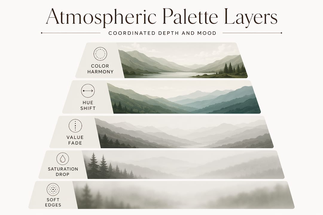
Pro Tip: When studying atmospheric palette examples in paintings, cover the foreground and look only at the background. If it reads as a flat, nearly monochromatic wash of cool, light, low-contrast color, the artist has done the atmospheric work correctly.
How artists build atmospheric color palettes
Understanding the mechanics is one thing. Applying them as a deliberate creative tool is another. Experienced artists pre-plan their atmospheric palette layers before touching the canvas, assigning each spatial zone its own temperature, value range, saturation level, and edge quality.
Here is a practical framework for how artists create an atmospheric palette from scratch:
- Identify your spatial zones. Divide the composition into foreground, middle ground, and background. Each zone gets its own color rules.
- Set the foreground. Use your warmest temperatures, highest saturation, strongest contrast, and sharpest edges here. This anchors the viewer’s eye and establishes the baseline.
- Cool and dull the middle ground. Shift hues slightly toward blue or gray. Reduce contrast by about 30 to 40 percent. Soften edges where shapes meet the sky or each other.
- Wash out the background. Push colors toward the lightest, coolest, most neutral versions of themselves. Edges should be nearly lost. Texture disappears entirely.
- Mix a dedicated atmosphere color. Rather than adjusting each color individually, mixing one unified atmosphere tone and adding it consistently across background surfaces creates cohesion that feels natural rather than mechanical.
Beyond spatial depth, artists also use atmospheric color palettes to express pure emotional temperature. Color palette choice functions as a psychological tool. A warm analogous palette of yellows, oranges, and dusty reds evokes desert heat, urgency, or nostalgia. A cool palette of blue-greens, soft lavenders, and pale grays suggests stillness, melancholy, or tranquility. Neither palette is copying local color literally. Both are making a deliberate emotional argument.
Artistic license matters here. Many painters exaggerate the atmospheric effect well beyond what the eye would actually see in nature. A mountain range that is only five miles away might be painted as pale and cool as one fifty miles distant, because the emotional effect of vast, quiet distance is the goal. The atmospheric color scheme serves the feeling, not the fact.
Pro Tip: If your painting feels flat despite correct values, check your edges. Soft, lost edges in the background contribute as much to atmospheric depth as color temperature does. Sharp edges anywhere in the distance will immediately collapse the illusion.
Atmospheric palettes in interior design
The same logic that makes a painted landscape feel deep and moody applies directly to how color functions in a room. Interior designers use atmospheric color schemes to shape how a space feels before a single piece of furniture is placed.
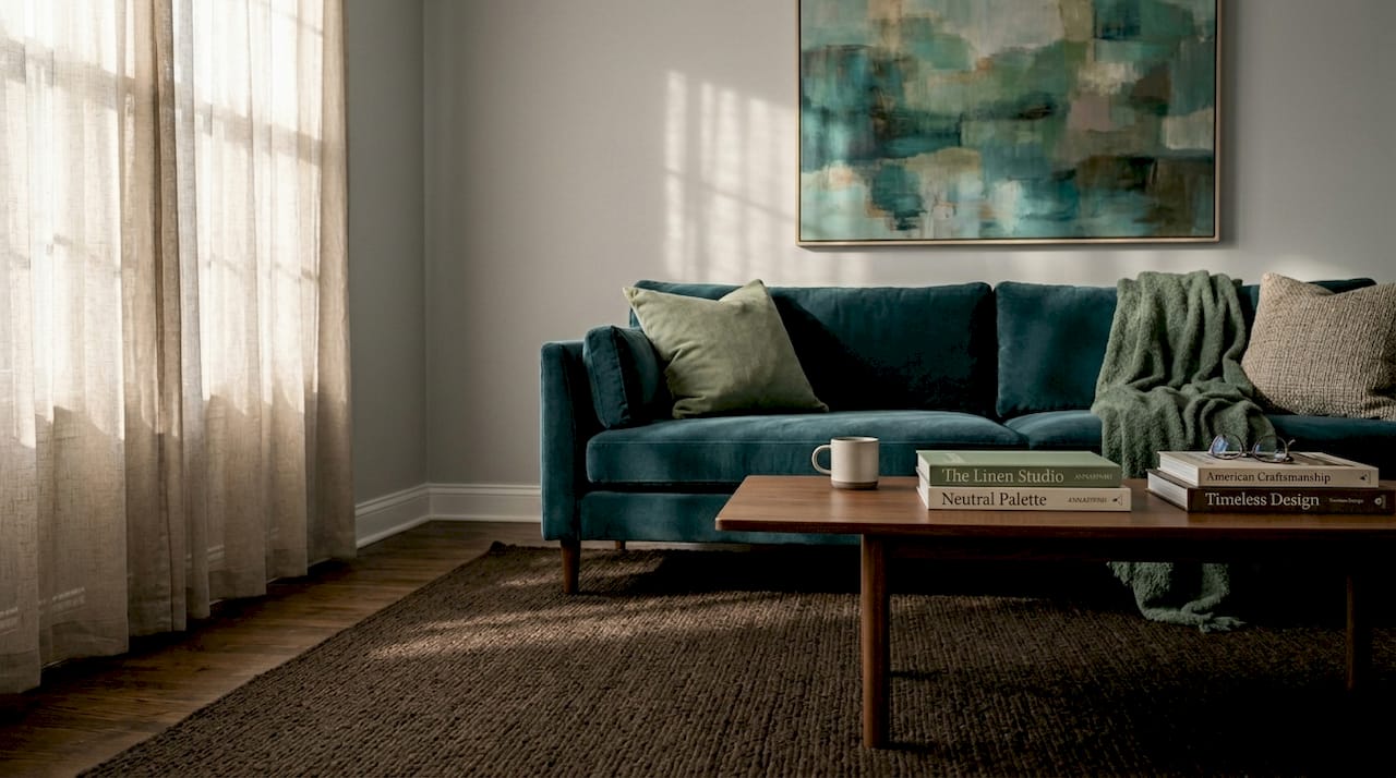
The structural foundation for this is the 60-30-10 rule. Sixty percent of the room uses the dominant color, which sets the overall mood. Thirty percent goes to a secondary color that supports and complements the dominant. Ten percent is the accent, which adds spark without overwhelming the whole.
Here is how three common atmospheric design approaches translate into real palette templates:
| Palette name | Dominant (60%) | Secondary (30%) | Accent (10%) | Mood created |
|---|---|---|---|---|
| Serene Sanctuary | Soft sage green | Warm linen white | Dusty blush | Calm, restorative, quiet |
| Earthy Elegance | Warm terracotta | Deep ochre | Muted olive | Grounded, rich, organic |
| Modern Luxe | Charcoal gray | Cool slate blue | Brushed gold | Sophisticated, composed, dramatic |
The proportional use of color is where most design attempts fail. People select beautiful colors individually but apply them in arbitrary amounts. A gorgeous terracotta accent becomes oppressive when used on three walls instead of one. A soft sage that should feel restful becomes invisible when used only on throw pillows.
A few practical points for applying atmospheric design techniques in your own space:
- Consider light direction. North-facing rooms receive cooler light, which shifts warm colors toward gray. A palette that reads as cozy in a south-facing room may feel cold in a north-facing one.
- Test colors at scale. Paint large swatches directly on the wall, at least two feet square, and observe them at different times of day before committing.
- Use texture as the equivalent of edge quality. Rough linen, smooth plaster, and matte paint all absorb light differently, creating the same kind of visual variation that soft edges create in painting.
- Let the dominant color breathe. Resist the urge to add too many accent colors. The atmospheric effect in a room depends on the dominant color doing most of the work, just as the sky does in a landscape.
Common misconceptions about atmospheric palettes
The most persistent mistake, in both art and design, is treating the atmospheric palette as a single-variable problem. Many beginners simply add blue or gray to distant areas and wonder why the painting still looks flat. The reason is that changing only hue while leaving contrast and detail unchanged breaks the depth illusion entirely.
Other common errors worth knowing before you start:
- Treating atmospheric perspective as a formula. The specific degree of shift depends on actual conditions: haze, time of day, season, and the emotional intent of the piece. There is no single ratio that works universally.
- Forgetting proportion in design. Selecting the right colors but applying them in wrong amounts produces the same failure as using the wrong colors. The 60-30-10 structure exists precisely because proportion is that consequential.
- Confusing atmospheric palette with a neutral palette. An atmospheric palette can include rich, saturated colors in the foreground or as accents. It is not synonymous with muted or washed-out. The coordination is what defines it, not the absence of color.
- Ignoring the role of the viewer’s eye. In both painting and interior design, the atmospheric palette guides where the eye goes and how long it stays. A poorly coordinated palette creates visual restlessness rather than depth.
Understanding atmospheric palette principles means accepting that no single element creates the effect. The coordination of all elements together is what produces the result.
My perspective on atmospheric palettes as a creative tool
I have been working with atmospheric palettes across hundreds of paintings, and the single most important shift in my practice came when I stopped thinking about individual colors and started thinking about relationships. The color in the background is not chosen because it is beautiful on its own. It is chosen because of what it does next to the foreground.
What I have found is that most beginners, whether they are painters or designers, focus almost entirely on hue selection. They spend hours choosing the right shade of blue or green, and then apply it without adjusting value, saturation, or edge quality to match. The palette looks right in theory and wrong in practice. The fix is almost always to push the background lighter and duller than feels comfortable, and to soften edges until they seem almost lost.
The other thing I have learned is that the emotional temperature of a palette matters more than its literal accuracy. When I painted Almost What You Thought, the goal was not to replicate a specific landscape. It was to create the feeling of a particular kind of light: soft, uncertain, leaning toward calm. Every color decision in that piece was made in service of that feeling, not in service of what the scene actually looked like.
That is the real power of understanding atmospheric palettes. You stop copying and start composing.
— Anna
Bring atmospheric palette artwork into your space
Annapinnii’s original paintings and fine art prints are built on exactly these principles. Each work uses coordinated atmospheric color relationships to create mood, depth, and emotional resonance rather than simply depicting a scene.
The original painting Almost What You Thought is a strong example of how a carefully structured atmospheric palette functions in a semi-abstract landscape. Warm, grounded foreground tones give way to soft, cool, luminous distance, creating a sense of quiet and space that works in a room the same way it works on canvas. For those looking to explore the full range of Annapinnii’s atmospheric work, the fine art prints collection offers accessible options across multiple palettes and moods. Each print is produced to preserve the tonal subtlety that makes the atmospheric effect legible at home.
If you are designing a space and searching for artwork that does the atmospheric work for you, these pieces are worth a close look.
FAQ
What is an atmospheric palette in simple terms?
An atmospheric palette is a coordinated set of colors that uses shifts in hue, saturation, value, and edge quality to create the illusion of depth and convey a specific emotional mood, in both painting and interior design.
Is an atmospheric palette the same as a cool color palette?
No. An atmospheric palette is defined by coordination across multiple visual variables, not just cool hues. It can include warm, saturated colors in the foreground while using cooler, duller tones in the background to suggest distance.
How do I use an atmospheric color scheme in interior design?
Apply the 60-30-10 rule: use your dominant mood color on 60 percent of surfaces, a complementary secondary color on 30 percent, and a contrasting accent on the remaining 10 percent. Proportion is as important as color selection.
Why does my atmospheric painting still look flat?
Flat results usually mean one or more variables are not coordinated. Check that your background has lower contrast, reduced saturation, softer edges, and lighter values than your foreground. Adjusting hue alone is rarely enough.
What are some examples of atmospheric palette styles in home decor?
Common examples include Serene Sanctuary palettes using sage green and linen white, Earthy Elegance palettes built on terracotta and ochre, and Modern Luxe palettes combining charcoal gray with slate blue accents.
0 kommenttia